How to Create Great Digital Signage Mirror Touch Screen Content (Part 1)
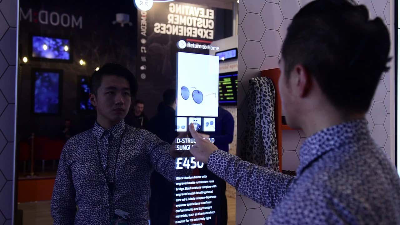
Mirror Touch Screens are a new and exciting way to grab customer’s attention. Some may pass a Mirror Touch Screen off as a gimmick but if used correctly then Mirror Touch Screens can have you engaging and interacting with customers like never before. Before continuing on with this blog I would recommend reading part 1 and part 2 of our guide on creating Touch Screen Content. These blogs set you well on the way to designing your content but a mirror Touch Screen provides a totally new kind of canvas that requires an entirely different train of thought.
Mirrors themselves are quite a personal object. The ability to reflect ones image is revealing and intimate in a way not many other everyday items are. When designing your content you need to think of this intimacy while also considering that it will be used by the general public, in public spaces, at the same time.
Colour Story
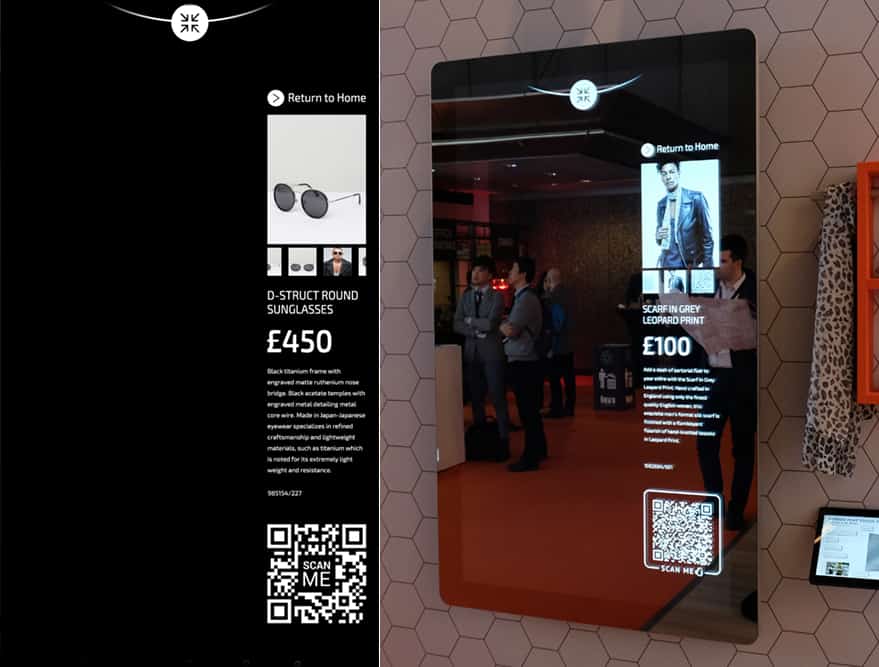
No matter what content you create the colour of your designs will be greatly affected by the mirror finish of the screen. On mirror screens areas in lighter colours, such as white, will show up well defined. Darker colours such as black will not show on a mirror screen and will instead appear reflective. This is shown more clearly in the images below. Create your mirror touch screen content on a black background. This will ensure that you maximise the amount of reflective area. It’s very unlikely that the entirety of your content will be dual tone so there is an obvious need for colours. When using colours I would make sure that you increase the brightness as well as the vibrancy or saturation, especially on images with darker colours. This will ensure to differentiate the tones in images for the users.

User Interface
When the majority of the screen is reflective you have to design a user interface that users can easily navigate around the Touch Screen content with. I would advise to only use thin white lines, creating buttons/icons this way will enable them to be seen more clearly which is a top priority when creating Touch Screen content. Make these lines sharp. No feathering or fades as this will just make the whole UI unclear and confusing for users. When it comes to fonts, sans serif fonts will work best on mirror displays. With the user interface the best advice I can give is to keep the layout clean looking. Clean lines, clean fonts will lead to a better experience for users.
Screensaver
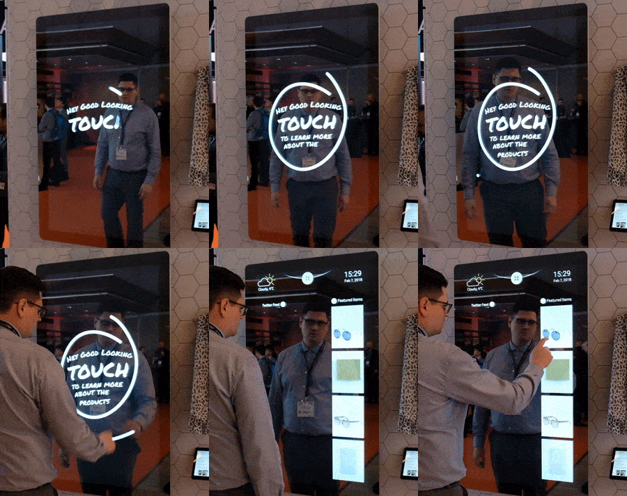
How can you make sure a user knows your Mirror Touch Screen is interactive? A Mirror Touch Screen more than any other Touch Screen needs a screensaver to alert users to the fact that the screen is interactive. A video that has movement is more likely to draw the attention of potential users. Below is a GIF of an example screensaver.

Have some fun with this. It’s not every day that users can actually interact with a mirror so a memorable screensaver will start the experience off in a great way.
For Part 2 of this blog please click here.

Tom Rock is a Marketing Manager for Allsee Technologies. His background is in Digital Signage and Graphic Design.


