How to Create Great Digital Signage Touch Screen Content (Part 1)
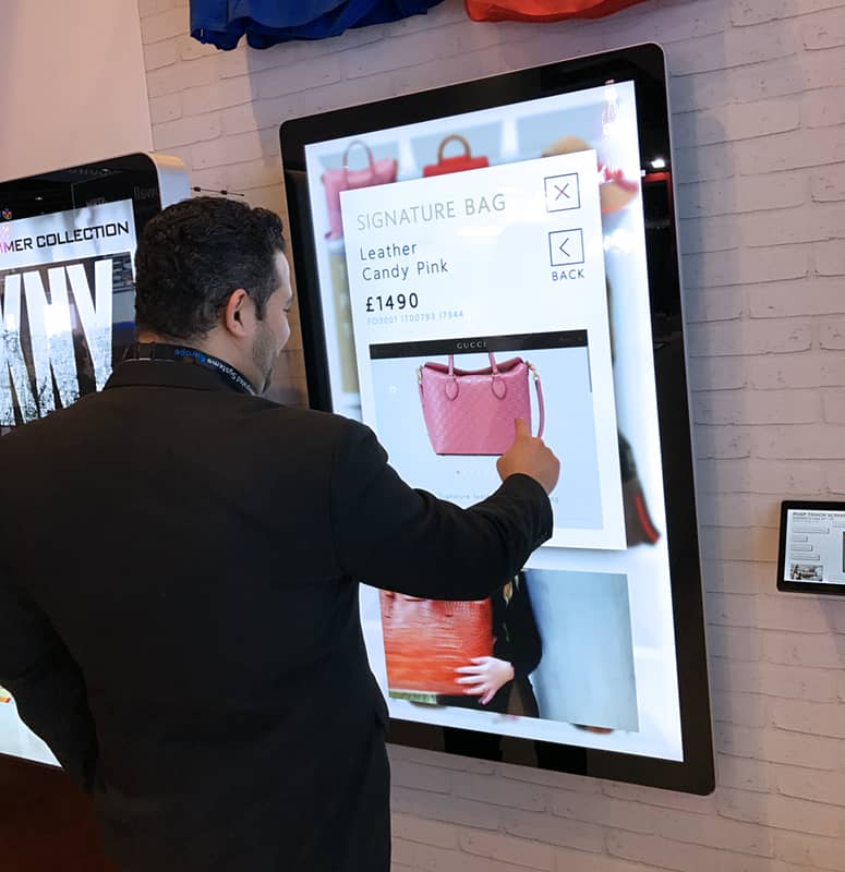
In the Digital Signage market there is a growing shift to Touch Screen and interactive content. Thanks to Smartphones and tablets the appetite for commercial Touch Screen solutions has grown exponentially. A whole generation is now being raised swiping and touching displays so this kind of technology is only going to become more ingrained in our culture. Digital Signage is not just about looking any more, it’s about engaging. This provides a tremendous opportunity for brands/organisations to engage with users in a different way.
The first step is deciding on how you are going to create your touch content on and what you will display it on. We would recommend using a commercial grade PCAP Touch Screen. PCAP touch technology is the same type of technology used in smartphones and tablets. This kind of technology allows for accurate touch readings and super smooth touch gestures. There are lots of differentiating ways to create Touch Screen content. A simple web search will throw up many different expensive and complicated solutions to this problem. Spending extortionate amounts of money is not needed. You should focus on what you actually need your content to do and see what the platforms can deliver. Our Touch CMS for example can be used to create Touch Screen content and has the features for the majority of applications with clever work-arounds for the rest.
Preparation
Use all the tools you have at your disposal – as with any digital content you should always plan and design what the content will look like before you start creating it. This philosophy should also apply when creating interactive Touch Screen content. When creating Touch Screen content I always sketch a basic layout then design in Adobe Photoshop first, but any design software can be used to figure out and decide the details of how Touch Screen will look and function. In most cases with Touch Screen content I would suggest not using the in-built text features; instead I would design any text exactly to be how I want in Photoshop and then export these as part of an image. Using this method there is much more flexibility to create text exactly as you want it to appear. Just because there is a static text function does not mean that is the only way you can have text.
Designing Media Alongside Playlists
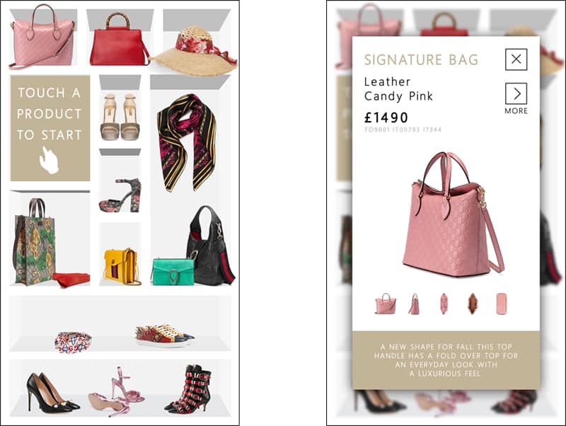
Touch content does not need to be boring boxes and buttons. Don’t forget to include your design skills. Using design programs you can create effects that improve the whole aesthetic of the content. For example in the Screenshot below a button has been pressed by the user and a pop up window has appeared. The user has actually been taken to a completely different page however due to the previous page still appearing underneath the ‘pop out window’ now blurred and under a drop shadow it still makes sense for the user. If a user was to click outside the ‘pop out window’ onto the blurred edge the user would be taken back to the previous page. Pretty cool right?

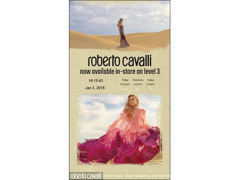
This can also be extended further by using layers. Remember that touch content does not need to be boring boxes and buttons. In the screenshot below you can see that the edges of the image and video zones have been covered creating much more visually appealing content to look at.

Considering Screen Size
When designing your content it is important to take into account the screen the content will be displayed on, more specifically the screen size. For example, if you are using a 10” POS Touch Screen or a 55” PCAP Touch Screen the usability will be very different in regards to buttons and text sizing. On the smaller screen the buttons and text should be larger taking up more space on the content when compared to creating a similar playlist for a larger screen. Tailor the content to the screen that it will be displayed on.
For Part 2 of this blog please click here.

Tom Rock is a Marketing Manager for Allsee Technologies. His background is in Digital Signage and Graphic Design.


